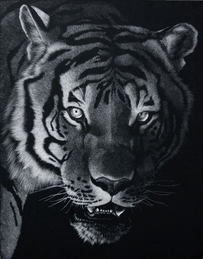
Tiger Scratchboard Just Finished

Slowly moving along here.  I’m really enjoying working through these projects.  Without the looming deadlines I once faced with my gallery, I have the luxury of devoting as much time to a piece as necessary to bring it to a satisfactory finish.  Three new pieces every two months at this level of detail was a stressful pace.  Hopefully multiple shows are in the future for this piece, starting with the Berks Art Alliance show this summer and The Goggle Works in Reading, PA. Goggle Works Offical Site

My goal is to produce at least ten scratchboards of this quality in time for the 2013 judging of the International Scratchboard Society.  I am currently an active member and I’m hoping to achieve at least a signature membership, which is one step down from the best of the best.  As a charter member of the society, it’s a distinction that will do well on my resume.


Advertisement

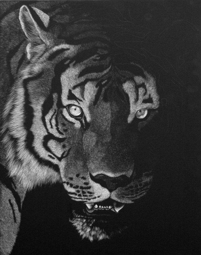
Tiger – Scratchboard in Progress

Information on this work should have been forthcoming some time ago as this piece is nearly halfway to completion.  I had in mind a portrait of a tiger that would be very confrontational and predatory, with raking light and strong chiaroscuro.  Wildlife art is flush with romantic portrayals of apex predators and I wanted something a little more sinister.  This is ambitious for me as I don’t have any images in my reference collection that would fit that description.  This composition is largely a conglomerate of at least a half dozen images; none of which featured precisely the type of lighting I was seeking; zoos tend not to be good locations for dramatic lighting.  From studying multiple images, I hope to accurately model the bone structure of this animal so the shadows falling across it’s face will be convincing.  The side to the viewer’s right should be lost in shadow compared to the lit half on the left.

Again, this is a scratchboard, 14X11.  Unfortunately I can’t positively I.D. the subspecies since I’ve sampled from multiple images, but it closely resembles a Bengal.  Click on the image for viewing at a higher resolution.

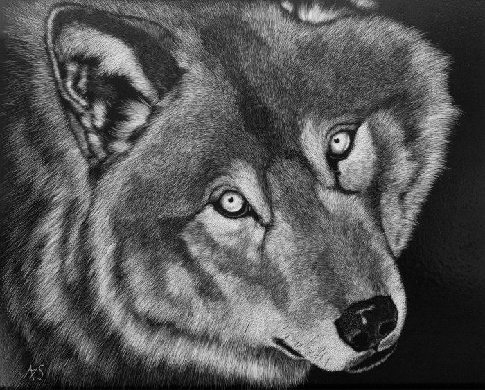
New Scratchboard – Grey Wolf

This is my largest and most ambitious scratchboard thus far.  I seriously underestimated how much work would be necessary to nearly cover such a large board and it became far more involved than I had anticipated.  However, I am quite pleased with the results and this piece is now framed and ready for the coming show at my gallery.  The title makes this a little politicized, especially for someone living near Yellowstone where these animals have been reintroduced.  Perhaps they are responsible for taking the occasional animal from a rancher’s herd, but they are not the sinister villains that popular sentiment would have them be.  Wolves are sorely misunderstood animals, with stories like Red Riding Hood and some primeval fear we have elicited by their chilling howl.  Yet, in their social structure, they are not unlike ourselves, more so than any other major predator.  We don’t need to wipe out our apex predators in order to live in peace with them.

We Must Not Be Enemies

12X16

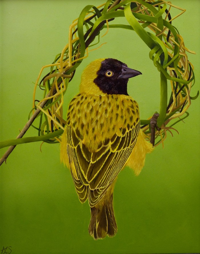
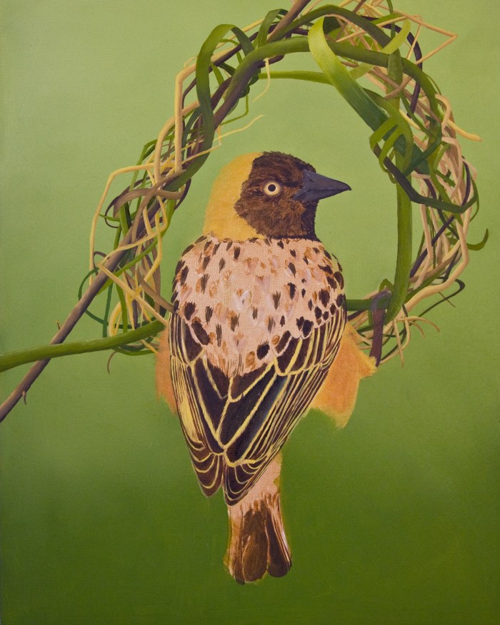
Masked Weaver – Finally Finished

This update has been a long time in coming.  I finished this piece quite a while ago and it is already framed and on display at the Art Plus Gallery in W. Reading, Pa.  I’m quite happy with the result, which came far easier than the last bird I had used as a subject.  I have decided that for the time being, there will be no more scratch board works of birds for me, only oils – it’s far less aggravating.  The woven nest was time consuming but caused me less grief than I had expected.

Interrupted – Southern Masked African Weaver

11X14, Oil on Masonite.

Masked Weaver Update

I’m long overdue for an  update for this project.  It’s moving along nicely and I’m enjoying working with the new Rembrandt oils colors that I purchased, as they have a far more creamy consistency with a higher pigment load than the W&N brand that I had previously been using, which could be very oily.  They are more expensive than W&N but you get what you pay for and the difference is making my life easier.  This looks like it’s rather far along but there is still so much more to be done.  I need to model the lights and darks in the grasses a great deal yet; they are still only a refined underpainting and appear very flat.  I want them to really look like a dimensional, tangled mess and that will require much more work.  And I’ve only just started working on the bird.  I’m hoping to capture the “business first” attitude that I remember from these guys; nothing is more important to him than finishing that nest and the viewer is but a rude interruption.

I’ve enjoyed working on these far less familiar species.  Charismatic animals like elephants and lions tend to get more coverage and the finished paintings certainly attract more attention.  Unfortunately, so many paintings have been done of lions and their ilk, they have become almost cliche.  It’s time for the less notable but equally precious species to have their day in the sun.

Southern Masked Weaver; 14X11, Oil on Masonite.

Masked Weaver

This is another work in progress, one with which I am quite happy.  It’s a male southern masked weaver, native to Africa, who paused in his work just long enough to contemplate the camera.  This is going to be a good exercise in patience.  I knew heading into this project that the grasses of the nest would be tedious and frustrating so I’ve devoted a lot of focus to making them look believable.  If Carl Brenders can render a thousand blades of grass and leaves, then I can force myself to do this.  I’m learning the hard way that there is no short cut to good realist wildlife, I just need to take my time.

The first image is the Imprimatura which is just a stain of the white of the board with some basic darks and highlights painted in.  The second image is the start of my underpainting.  I have about five thin glazes of paint over the green background, which was necessary to get a nice smooth color transition and I am on my first layer with the grasses in the nest.

This is oil on masonite, 14X11.

Macaw Update

After more work on the macaw pair I finished the first layer of scratching and washed ink over the entire board.  The ink I’m using is Ampersand’s brand of scratchboard inks which are thin out of the bottle; like caligraphy inks.  Allegedly they are specially formulated to blend seamlessly over the black india ink once varnish is sprayed on the board.  For now, any overpainting is very obvious, especially in the third photo, but that will be invisible by the time the piece is done.  They do blend well, but I’ve never compared them to how any other paint would perform for the same task.  Some scratchboard artists have been using acrylic paint of colored pencils and I hope to try those myself sometime.

These pictures show the board after the first layer of ink, second scratching, and finally second layer of ink, which was a lighter green/yellow than the previous color.  The third picture suffered from a lot of glare and the black looks washed out.

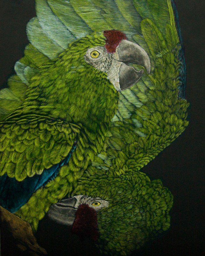
New Macaw Scratchboard

 I decided for my next scratchboard that the subject would be avian.  I had seen other scratchboard artists do work with birds as the subject and really liked the effect.  I certainly  underestimated how time consuming this would be.  Feathers have thus far been the most difficult thing I’ve attempted to render in either oil or scratchboard.  This is on Ampersand Scratchboard, and the size is 14X11.  It will be a pair of Millitary Macaws, which are native to Central America

This first image is from several days ago and is a crop of the first bird’s face, the color cast here is very blue, but it’s a good closeup of the detail. 


This image is where I am currently at in the process for this piece and shows the entire board.  Although this does appear to be nearly finished, this is just the first layer of scratching.  I am planning to color this piece so after this stage is complete I will ink most of it with a dark green that will be the middle tone/shadow colors and then will go over it again several times to give it more definition.  It looks really flat now because almost everything has been scratched without paying much attention to the shadows and highlights that would indicate what is called “turning form”, or the way color and shadows change as light falls on a three dimensional object.  It is very difficult in scratchboard to create areas that are simultaenously detailed and also in shadow.  Middle tones can be achieved by reducing the density of scratches, but that reduces the clarity of the image and it tends to make the light appear very harsh.  That can be effective for some subjects with dramatic lighting but I want the light have a softer, more natural feel in this one.  Once I ink it for the first time the areas that should be in shadow will appear much darker.  For the finished peice it will help create the illusion of areas that are dimly lit, but that still have discernable detail, much like the eye can pick out detail in shadows in real life.